Random Restless

Showing posts with label Architecture. Show all posts

6/27/12

Yet More Ulgy NYC Buildings


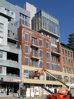
Mercifully, we've reached the bottom of my Barrel of Ugly...  Above left, on Greenpoint Ave. in Greenpoint, a building so cursed that I'm certain the current renovation (including removal of the inviting metal "come in and get stabbed" nightclub entrance) will fail to improve its looks.  Above right, proof that the clueless use of details to spice up a hopeless design always amplifies the failure: (Top) French sailor shirt stripes and black refrigerator-bin balconies glued on a generic condo-pile on St. Marks Place, (Bottom) what look like blue tape stripes buzz on bright orange brick at the north end of Battery Park City.


Above l-r: (1) the largest and most infantile entry here, south of the Port Authority Bus Terminal, (2) the backside of the Bowery Hotel, showing off its dumpy HVAC "bell tower," (3) the screaming plastic SVA Theatre on 23rd St.


Above l-r: (1) NYU suburban civic center schmaltz across from Washington Sq. Park, (2) concave balconies make a grim condo fortress look even worse on Meserole St. in Williamsburg, (3) the roof tumor known as the Blue Moon Hotel, on Orchard St. off Delancey.

Below left, at Lexington & 27th St., a giant dirty air filter.  Below right, a mishmash progression of styles culminating in the "luxury box" top right, on Essex St.


[Earlier: More Ugly NYC Buildings]

6/25/12

More Ugly NYC Buildings


More proof that Ugly never sleeps in this city, and that scale has no moderating effect on it (these are all large buildings).  Above, at 6th Ave. & 25th St., a two-toned brown monster with boxy tan outlines near its base.

I'd like to think that the outlines were a conscious effort on the part of the architect -- that they were intended, through sheer ugliness, to distract the eye from the massive heap above -- but the more I look at ugly buildings the more obvious it becomes that they're conceived (just like humans) in the most thoughtless, optimistic and irresponsible (drunken) state possible.


Above l-r: (1) inspired by bathroom furniture?, at 11th Ave. & 24th St., (2) an enormous tan dirty-plastic toy at 5th Ave. & 40th St., (3) another brown two-toned crime against vision from 9th Ave. & 40th St. (that looks a lot better in the aerial still from The Bourne Ultimatum, right).


Above l-r: (1) a massive insult to fluted columns at 3rd Ave. & 86th St., (2) proof that bolting a bunch of used parts together still gets you Frankenstein, on 49th St. off 10th Ave., (3) a dirty bee of a building that would fit right in across the freeway from an oil refinery, at Park Ave. & 54th St.

And finally, below, several examples of the "brick pile" style favored by budget hotels and developers who'd build with garbage-insulated cardboard panels if they could get away with it.


Above l-r: (1) the Holiday Inn on Nassau St. at Maiden Ln., (2) on 39th St. off 8th Ave., (3) on 29th St. off 6th Ave., (4) on 31st St. off 6th Ave.  Below l-r: (1 & 2) three brick piles from 6th Ave. & 28th St., (3) a "corner pile" at 6th Ave. & 18th St., (4) an orange pile with graffiti accents at 2nd Ave. & 61st St.


[Earlier: More Ugly NYC Buildings]

3/12/12

Architectural Hardware


A few cases where functional hardware is a design element.  An obvious one, above, is the pint sized chemical plant on top of the Penn Station LIRR entrance on 34th St.  Left, an apparently permanent crane (like a windshield wiper) at 18th St. & 7th Ave.

Below left, on Allen St. near Rivington, ventilation pipes for the place next door -- so its exhaust doesn't foul the cheesy stallion medallion on the new hulk?  Below right, on 23rd St. off 3rd Ave., some proudly exposed pipe.


Below left, a headband of small HVAC units above Lexington Ave. in the upper 20s; below right, one big HVAC perched like a tiny head on a robot at Purves & Jackson in Long Island City.


And below, one of my favorite pieces of hardware headgear -- at once functional, futuristic, and vaguely fascist -- on Warehouse 11 in Williamsburg.

8/23/11

More Ugly NYC Buildings


From the bottomless pit of ugly buildings in NYC...  Above left, 320 Park Ave., which predates post-Modern (built 1960) but still manages to mix 'n match a Frankenstein.  Above right, the Residence Inn on 6th Ave. at 39th St.  It insults the sky with an orange tower, and at the sidewalk "preserves" the Millinery Workers Synagogue in its brutal 3-fingered fist, one knuckle over from its orange circus tent entrance.


Above, the world famous Middle Finger of Times Square, at Broadway and 49th St.  I could forgive it if black smoke belched out the smokestack, but no such luck.


Above, the Equitable Building on 7th Ave. at 51st St.  The shiny flesh tones might be okay for Mens Room tiling, but here -- along with the puny arch "head" on top and the shoulder epaulets, above left -- it just makes for another badly dressed monster.  At least its socks -- the blue awnings for the Citibank and Chase branches on the corners, above right -- match.


And finally, above, Frankenstein's hick cousin balancing a beer on his head, at 312 E 30th St.  I am pretty sure this thing, along with the items below left, was the inspiration for Karl Fischer's 20 Bayard, below right.


Earlier: The Ugliest Buildings in NYC

7/19/11

1400/1410 Broadway 1

Left: 1410 in reflected light.  Right: The Empire State's spire over 1400's shoulder

I've featured 1400 Broadway before, with its dramatic scaffolding (here) seen from 6th Ave.  It's a huge building that wraps in an L around its prettier sibling at 1410 Broadway.  I didn't understand how they fit together until I saw an aerial photo at Google Maps (3D block version to the left, with 1410 at the block's top left corner).

Both 1400 Broadway and 1410, aka the Bricken Casino Building, were designed by Ely Jacques Kahn Architects.  According to a few accounts, "In 1937, Ayn Rand worked as a typist without pay in Kahn's office to research her novel The Fountainhead."  At least Khan had the sense to not pay her.


I used the term "sibling" above because the buildings have some common underlying elements and their setbacks are nearly identical, as you can see just above, and best in this 1931 photo at Flickr [eralsoto].  Unfortunately I haven't found out where the Bricken Casino Building, below and top left, got its name.

4/19/11

From Brooklyn Bridge


From near the Manhattan end of the bridge, above, downtown is a brutal wall of ugly.  There are still a few appealing towers in there from the '40s aerial shot to the left, where the tallest buildings were slender as the Woolworth Building.

But I found just one newer building I like, below left.  The rest are fat boxes featuring schlock color or clumsy patterns, that manage to make whatever they're made of look cheap and artificial.


There's more visual interest created, unintentionally, in canyons between humbler buildings, like above right.  And as much as the I dislike the crooked Global Elite / Wall Street money that made Gehry's tower possible, I'd rather look at it and the buildings around it, below, than further downtown.