The surface and detail of a building can affect viewers in the same visceral way size and shape do. So even a huge box like the World Trade Center's 7 WTC, above, can avoid crushing its surroundings if it has a good complexion.
Of course a reflective surface that mirrors the sky and other buildings makes that easier (and if too many buildings were reflective the city would turn into a giant light-amplifying death ray) but 7's surface is not just reflective -- it has a translucent depth that embodies the thought put into it.
 |  |
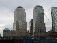
An example of a thoughtless, ugly surface is right across the West Side Highway, at the World Financial Center (WFC), just above and below left. Its surface looks like brown plastic mailing tape, and the "grand entrance" on the complex's south side, above right, should come with a warning that -- like Lot's wife leaving Sodom -- bad things will happen if you take a good look at it. You will turn into plastic.
The WFC towers look best when light hits them at the angle below left, but still worse than the most clichéd shot of 7 WTC, below right.
 |  |
Even 7 WTC's corrugated chrome looks good, below. Note the speeding pigeons near the bottom left.

[ 7 WTC's Clear Complexion 2 ]
[ The See-Through Skyscraper, City Room ]


